FromDaDy: Exploration of Aircraft Trails by Air Traffic Experts
| Christophe Hurter | IRIT Toulouse, France |
| St�phane Conversy | ENAC Toulouse, France |
Published: October, 2010
 |  | Full article |
Summary of the Tool
FromDady is a visualization software. It addresses technological issues to explore, filter and display large heterogeneous datasets (up to 4 million data). This software stems from innovative research and development in the HCI (Human Computer Interaction) and the InfoVis (Information Visualization) fields.
Summary of its Impact
The authors provide three concrete examples of impact.
Unexpected Discoveries
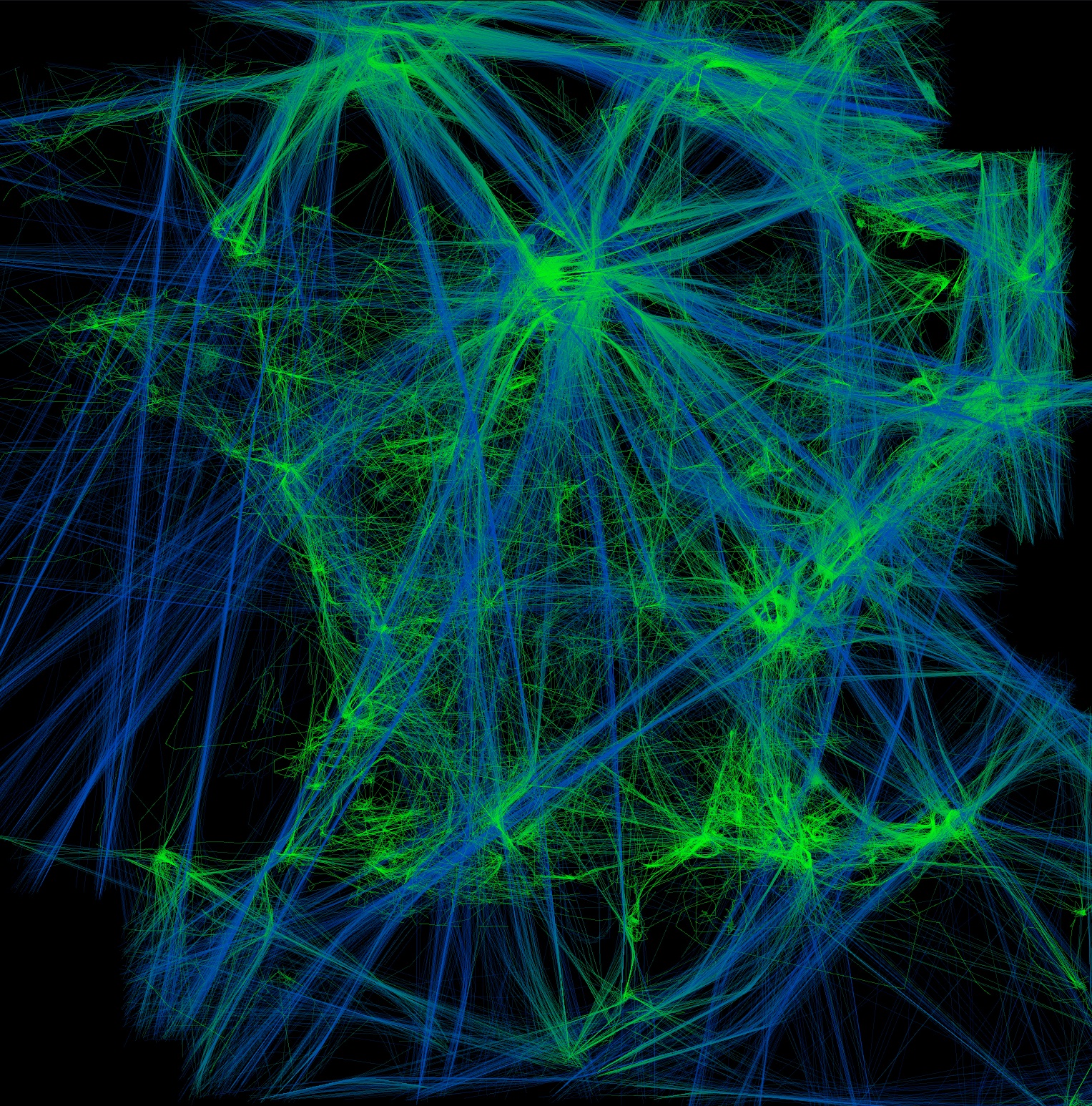
The data are one day record of aircraft trajectories. In the following image the user chose to display aircraft latitude, longitude and altitude. The gradient from green to blue represents the ascending altitude of aircraft (green being the lowest and blue the highest altitude). Dense colored areas correspond to airports. The users expected the visualization of the high altitude flight routes with straight blue lines. But the coastline (in this case, the French one) emerges as a consequence of sightseeing in light aircraft, which wasn�t expected. This image partially reveals weather conditions. Light aircraft fly mostly at low altitude which produces green lines. Hence, areas without green lines mean that no small aircraft flew there, which means by extension that the weather conditions were bad.
 |  |
Dataset Flaws Detection
In this example, the user�s main concern was to check the validity of the recorded radar data: radars send data over networks with a constant stream rate (one radar position of each aircraft every 4 to 8 minutes) and the user wanted to check that the data stream was not interrupted. Due to the large number of records, a lot of cluttering occurs (next picture, left) when displaying the time series of the aircraft�s identifiers. The cluttering hides the areas where, during a small time period, no data were recorded. Hence the user was unable to discover this flaw in the database, unless he or she zoomed over the specific areas to reduce the cluttering of points, which is unlikely.
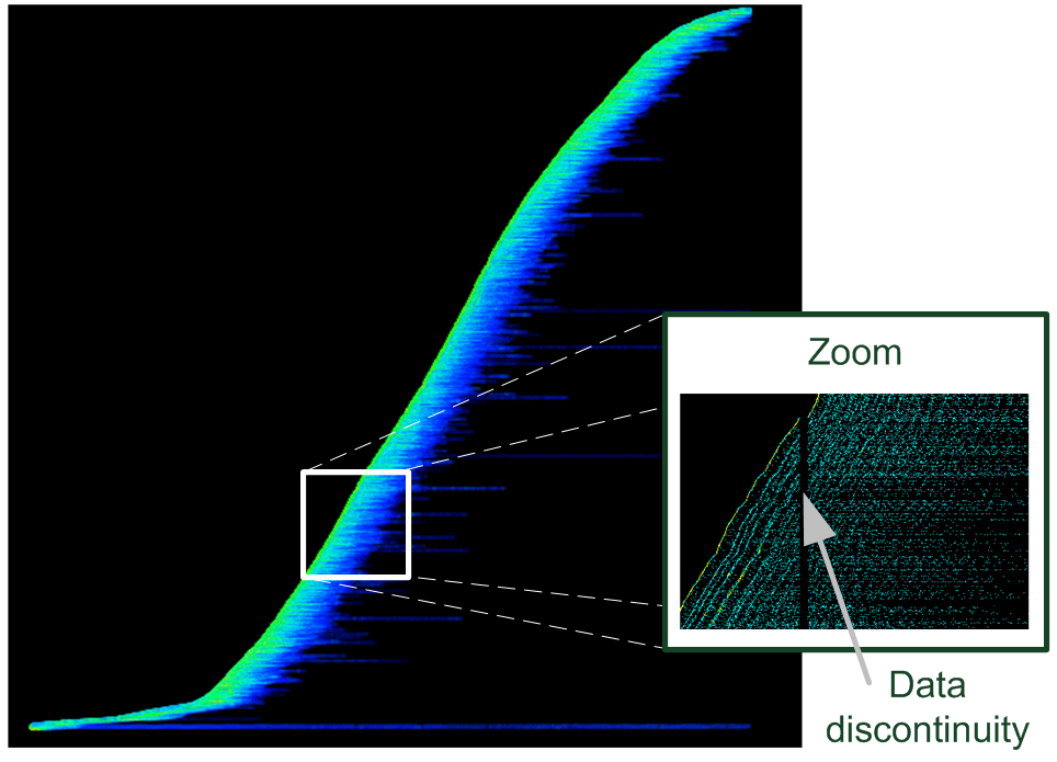 | 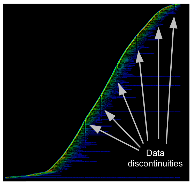 |
To notice this flaw without serendipity, the user can use the accumulation tool (by producing a accumulation map) with the same visual configuration (the visualization of the time series of aircraft identifiers), which unveils continuous and discontinuous data stream. Continuous data stream over time produces flat accumulation (the same amount of data are accumulated over time), whereas discontinuous data stream produces ridges (increase of the data stream rate) or furrows (decrease of the data stream rate). Because during a specific time-span no data are recorded, the produced accumulation view displays many furrows. Each of these furrows indicates that during the time corresponding to its thickness, no data were recorded.
Flight Route Optimization
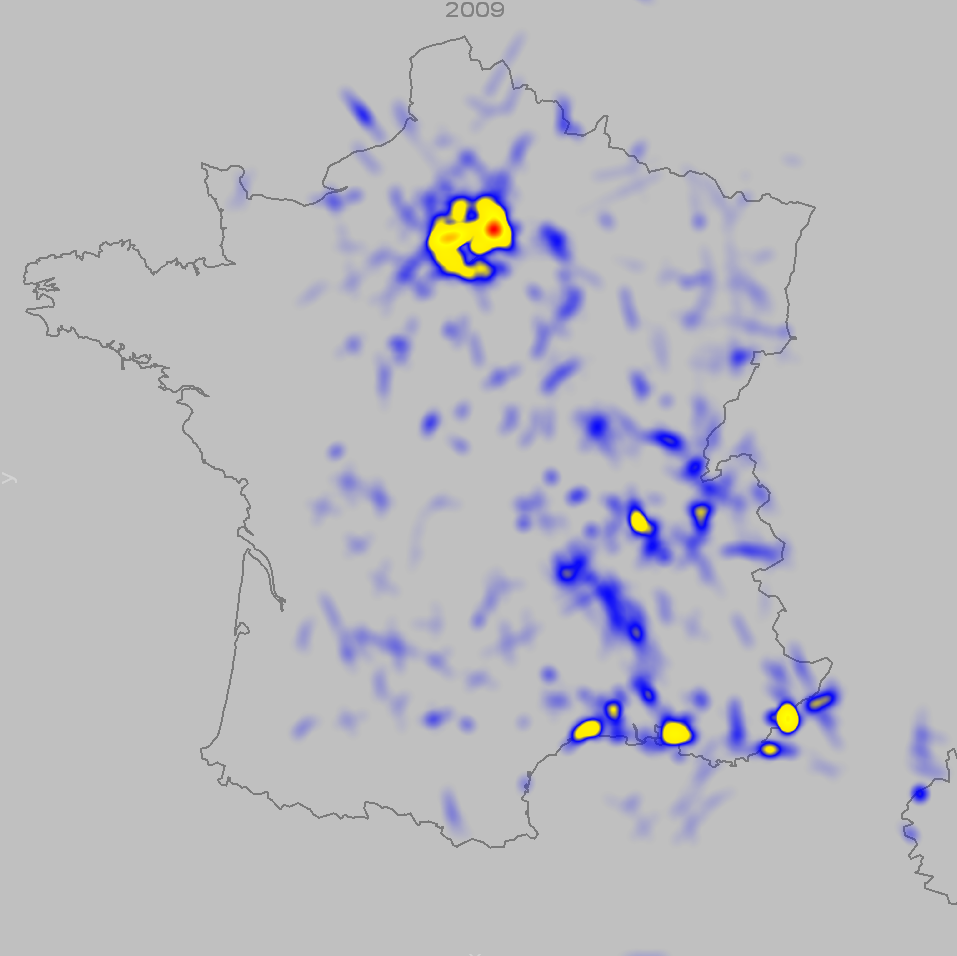 |
The activity of air traffic controllers consists in maintaining safe distances between aircraft by giving clearance to pilots (heading, speed, or altitude orders). The traffic is planned in advance: companies must request a flight plan from the regulatory authorities, which is translated into a mandatory flight route. FromDaDy is currently used to optimize the flight routes of aircraft over france. To do so, users analyze one year of safety net alarms. These alarms trigger when aircraft fly below the safety distance. These alarms are common since Air Traffic Controllers supervised aircraft in dense areas and cannot avoid all of them. Paris is of course the main dense area with the main amount of alarms. However, when visualizing all these alarms over one year period, users discovered that some unexpected dense area emerges: Montpellier, which is by far a smaller airport, exhibits a lot of alarms. This visualization triggered an official study of the flight routes of Montpellier, which may lead the regulatory agency to modify existing routes, and increase safety and capacity.
Links
Copyright of article and images belongs to the author or his employer unless otherwise mentioned